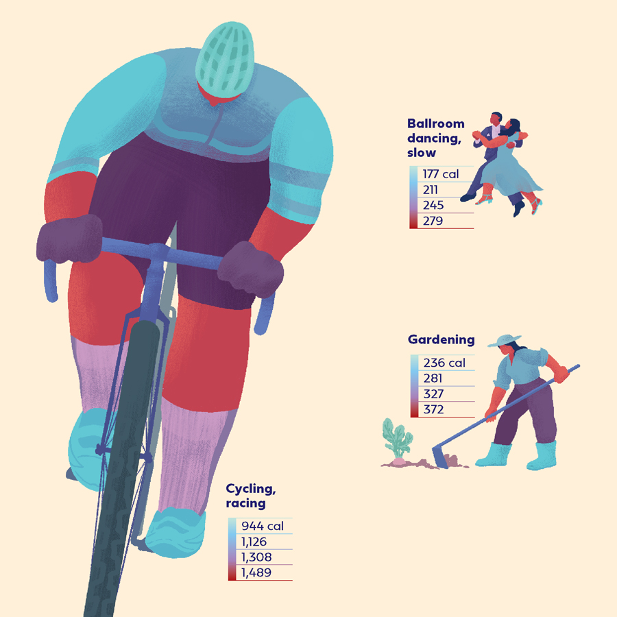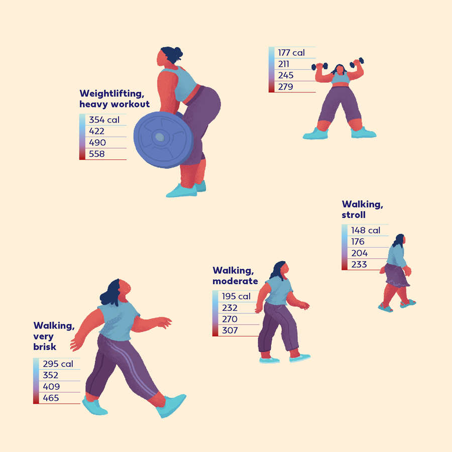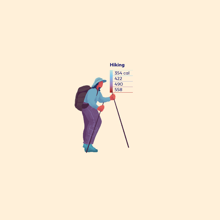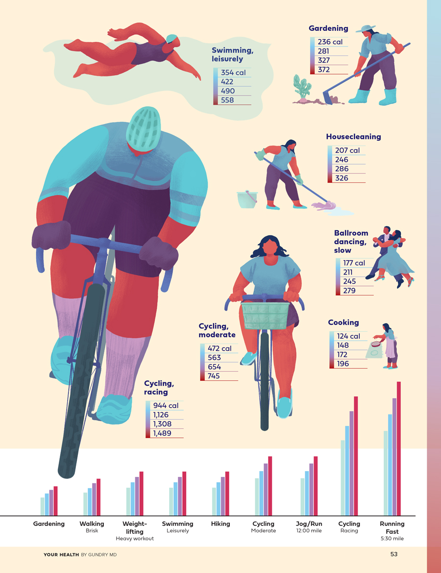
Illustrated infographic in Your Health by Gundry visually comparing the calorie-burn rates of different activities.
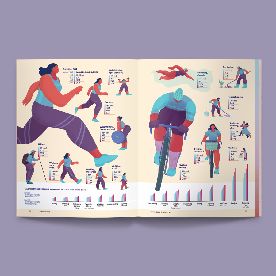
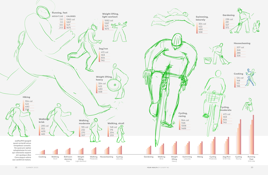
For the illustrated portion, I knew right away I wanted to use the same, strong-looking figure for all of the activities with the same color palette. This is not my usual style of rendering the figure so it was a bit challenging. The hardest one was cycling. The most fun ones were ballroom dancing and gardening. What I enjoyed most was thinking of the ways to make the clothing differ from activity to activity. Even between a run and a jog, I changed the number of stripes on her pants as a subtle indicator of intensity.
The layout was guided by some simple data visualization. I wanted the calorie-burn rate to be spacially represented — the higher the rate, the larger the area in the layout. The lowest rate (cooking) was given the value of 1 (or 100%), and everything above it was a percentage of that lowest value. So, running, for example is an ~850% increase in burn rate, so the area allotted to running should be ~8.5x larger than that for cooking.
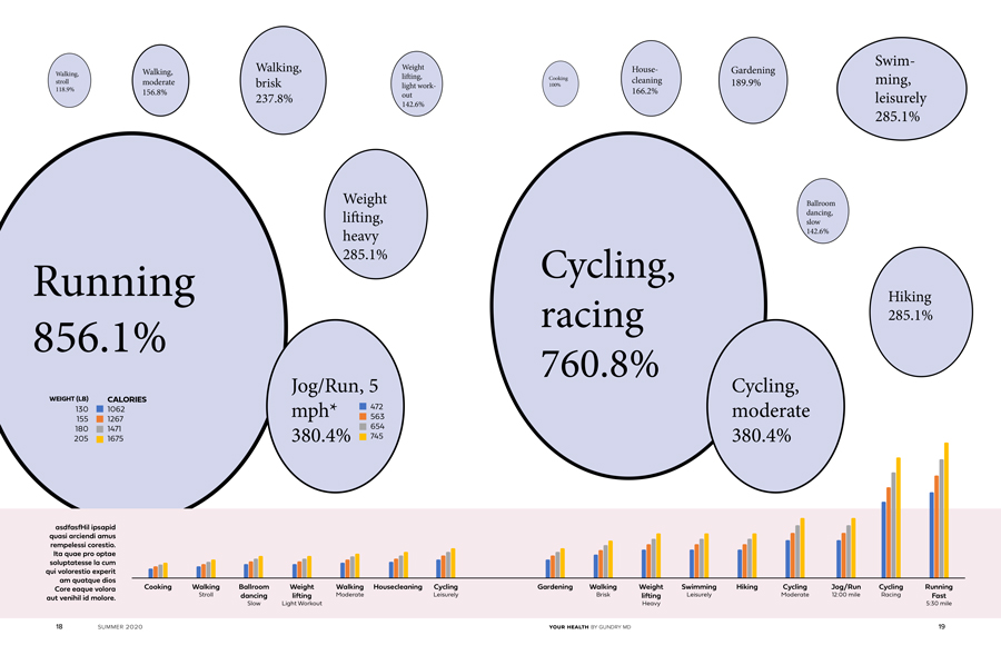
I did eventually deviate a little from the super-rough data viz layout for better fit in the layout. This particular infographic didn’t require a mathematically sound level of visualization accuracy so there was some wiggle room to make it a better-looking final product.